

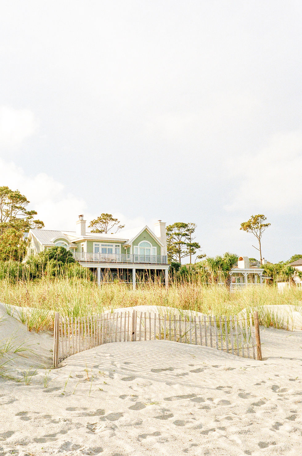
118 E Broughton St
This project focused on creating a thoughtful, user-friendly experience that balances visual storytelling with clear structure. The goal was to highlight key details while keeping the layout clean, flexible, and easy to navigate.
Design decisions were guided by simplicity, consistency, and adaptability across devices. Typography, spacing, and visual hierarchy were used to create flow and reinforce the overall aesthetic without overwhelming the content.
This space is intentionally concise and will evolve as final copy, imagery, and functionality are refined.

Project 2
This project focused on creating a thoughtful, user-friendly experience that balances visual storytelling with clear structure. The goal was to highlight key details while keeping the layout clean, flexible, and easy to navigate.
Design decisions were guided by simplicity, consistency, and adaptability across devices. Typography, spacing, and visual hierarchy were used to create flow and reinforce the overall aesthetic without overwhelming the content.
This space is intentionally concise and will evolve as final copy, imagery, and functionality are refined.

Project 3
This project focused on creating a thoughtful, user-friendly experience that balances visual storytelling with clear structure. The goal was to highlight key details while keeping the layout clean, flexible, and easy to navigate.
Design decisions were guided by simplicity, consistency, and adaptability across devices. Typography, spacing, and visual hierarchy were used to create flow and reinforce the overall aesthetic without overwhelming the content.
This space is intentionally concise and will evolve as final copy, imagery, and functionality are refined.

Project 4
This project focused on creating a thoughtful, user-friendly experience that balances visual storytelling with clear structure. The goal was to highlight key details while keeping the layout clean, flexible, and easy to navigate.
Design decisions were guided by simplicity, consistency, and adaptability across devices. Typography, spacing, and visual hierarchy were used to create flow and reinforce the overall aesthetic without overwhelming the content.
This space is intentionally concise and will evolve as final copy, imagery, and functionality are refined.
Project 5
This project focused on creating a thoughtful, user-friendly experience that balances visual storytelling with clear structure. The goal was to highlight key details while keeping the layout clean, flexible, and easy to navigate.
Design decisions were guided by simplicity, consistency, and adaptability across devices. Typography, spacing, and visual hierarchy were used to create flow and reinforce the overall aesthetic without overwhelming the content.
This space is intentionally concise and will evolve as final copy, imagery, and functionality are refined.